Guide to Using the Sector Momentum Map
The SPDR Sector Momentum Map provides investors with a quantitative approach for identifying how sectors are trending relative to their US, European and World benchmarks and sector peers. The Map serves to complement the fundamental and flows data featured in our quarterly Sector & Equity Compass.
Introduction to the Sector Momentum Map
The Sector Momentum Map (‘Map’) is powered by RRG® Research (as seen on Bloomberg Terminals). We are now in our second year of partnership with RRG to provide this sector rotation visualisation tool to SPDR clients.
The Map features relative strength and price momentum, which can indicate emerging opportunities and risks among sectors. Spotting the rotation of sectors in and out of favour can enable investors to anticipate money flowing from one sector to another and adjust portfolios accordingly. The benefit with this tool is seeing combinations across all sectors, neatly presented in one chart.
What the Map shows
The Map is built on two relative strength metrics:
- The JdK RS-Ratio measures trends in relative performance. This algorithm tries to find trends in the relative performance of each sector, comparing against the trends in relative performance of the other sectors in the universe. The comparison of relative trends across a universe is not always possible with traditional relative strength metrics.
- The JdK RS-Momentum measures the momentum of the relative trends detected by the RS-Ratio, again in a way that allows for comparison across a universe. Because rate of change is a leading indicator, it can serve as an early warning system for potential trend changes.
How to interpret the Map
The sectors generally rotate in a clockwise fashion around the centre (the market benchmark). Sectors in the top-right, or LEADING, quadrant are in a relative uptrend against the benchmark and that uptrend is being pushed higher by strong positive momentum. These sectors can be expected to outperform and could be relatively attractive for investors.
When a trend starts to deteriorate, this will be indicated by a loss of momentum, which will usually cause the sector to rotate into the WEAKENING quadrant. These sectors are still in a relative uptrend but their trends are losing momentum. This can be viewed by investors as a risk.
If that weakness continues, the sector will continue its rotation into the LAGGING quadrant. These sectors are in a relative downtrend against the benchmark and that downtrend is being pushed lower by negative momentum. These sectors can be expected to underperform the benchmark. The move that will signal change is an improvement in momentum, turning from negative to positive. That will cause the sector to rotate into IMPROVING. These sectors are still in a relative downtrend but are picking up positive momentum. Investors can interpret this as a relatively attractive opportunity.
If that improvement in momentum continues, the sector will usually rotate back into the LEADING quadrant.
Whereas the general pattern, as described, is a clockwise rotation, in strong up or down trends a rotation can complete on one side of the chart. Thus in the case of a very strong (and reliable) uptrend, rotations from LEADING into WEAKENING and then back into LEADING are possible. Conversely, strong (and reliable) downtrend rotations are possible from LAGGING into IMPROVING and then back into LAGGING.
Toggle the settings
Investors have several options for customising what they want to see on the Map:
- Universe: a choice of three regions is available – Europe, US, World/Developed Markets. SPDR offers sector ETFs in all three regions. A new “Overlay” option has been added, allowing the regional Maps to be viewed together.
- Frequency: the chosen timeframe can affect the RS-Ratio and result in different conclusions – a weekly setting captures the long-term trend, while daily captures a shorter trend.
- Securities: it is possible to view all or a selected number of sectors together to aid comparison of trends or to limit the scope for a clearer image.
- Settings: switching on Tails can allow the Map user to see where the security has moved.
A history of up to 12 months is available, which can be accessed by dragging the dark green bar toward the left.
Example: Snapshot of European sectors across all 4 quadrants
Figure 1 shows sectors on the move on a day-to-day basis, with the Tails indicating the direction of travel over the previous 2 weeks. In this case, Technology is in an attractive position with improving relative strength and positive momentum, placing it in the LEADING quadrant, whereas Utilities is showing the opposite trend within the LAGGING quadrant.
Figure 1: Snapshot of European Sectors on Daily Basis over Two Weeks
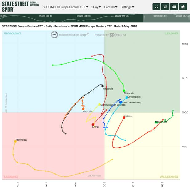
Source: RRG, as of 3 April 2023. The chart is for illustrative purposes.
Example: Rotation of European Financials
Figure 2 shows the path of European Financials over a whole year from late March 2021, set on a weekly basis. This chart depicts a full rotation.
In April 2021, the sector moved into the WEAKENING quadrant during a period of relative strength but falling momentum. This downtrend may have acted as a warning signal for some investors. Relative strength weakened week by week through to August, at which point the sector was entrenched in the LAGGING quadrant. Thereafter, there was a turnaround in momentum from negative to positive, and relative strength improved, taking Financials into the IMPROVING quadrant in September.
A month later it rotated into the LEADING quadrant as relative strength picked up, usually taken as a comforting signal. The trend within the LEADING quadrant was not smooth, with a short downtrend through December 2021, and then again in March 2022, after a loss of momentum for several weeks, although the relative strength was still apparent.
Figure 2: Snapshot of MSCI Europe Financials on Weekly Basis over One Year
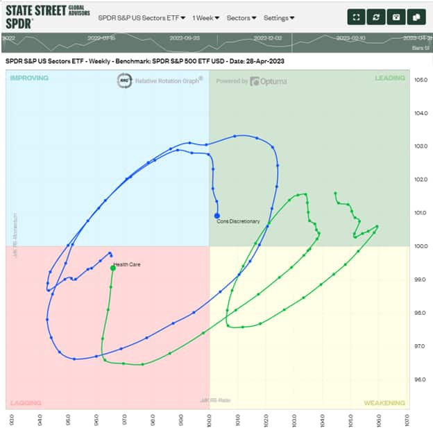
Source: RRG, as of 3 April 2023. The chart is for illustrative purposes.
To use the Sector Momentum Map, please click here.
To learn more about our broader sector ETF capabilities, please click here.
For up-to-date comments on sector positioning on the Map and how that fits with our fundamental views, please request to join the mailing list for Sector Talk by contacting your local sales representative.