State Street Sector Momentum Map
For many years, we have partnered with RRG® Research to bring a striking sector rotation visualistion tool to our clients .The Sector Momentum Map is a quantitative approach for identifying how sectors are trending relative to their US, European and World benchmarks as well as sector peers.
Introduction to the map
The map features relative strength and price momentum, which can indicate emerging opportunities and risks amongst sectors. Spotting the rotation in performance between sectors can enable investors to anticipate growing preference for one sector over others and adjust portfolios accordingly. The benefit of this tool is seeing combinations across all sectors neatly presented in one chart.
What the Map shows
The Sector Momentum Map/RRG is built on two relative strength metrics:
- The JdK RS-Ratio - measures trends in relative performance. This algorithm seeks trends in the relative performance of each sector, comparing against the trends in relative performance of the other sectors in the universe. The comparison of relative trends across a universe is not always possible with traditional relative strength metrics.
- The JdK RS-Momentum - measures the momentum of the relative trends detected by the RS-Ratio, again in a way that allows for comparison across a universe. Because rate-of-change is a leading indicator it can serve as an early warning system for potential trend changes.
How to interpret the Map
The sectors generally rotate in a clockwise fashion around the benchmark, which is represented by the intersection of the grid lines numbered 100. Sectors in the top-right, LEADING, quadrant (see below) are in a relative uptrend against the benchmark and that uptrend is being pushed higher by strong positive momentum. These sectors can be expected to outperform and could be attractive for investors.
When a trend starts to deteriorate, this will be indicated by a loss of momentum, which will cause the sector to rotate into the WEAKENING quadrant. These sectors are still in a relative uptrend, but their trends are losing momentum. This can be viewed by investors as a risk.
If that weakness continues the sector will continue its rotation into the LAGGING quadrant. These sectors are in a relative downtrend against the benchmark and that downtrend is being pushed lower by negative momentum. These sectors can be expected to underperform the benchmark.
The first thing that will change if there is improvement is momentum, turning from negative to positive. That will cause the sector to rotate into IMPROVING. These sectors are still in a relative downtrend but are picking up positive momentum. Investors can interpret this as an attractive opportunity.
When that improvement in momentum continues, the sector will eventually rotate back into the LEADING quadrant.
Whereas, the general pattern is a clockwise rotation, in very strong up or down trends, a rotation can complete on one side of the chart. Thus in the case of a very strong (and reliable) uptrend, rotations from LEADING into WEAKENING and then back into LEADING are possible. Conversely, strong (and reliable) downtrend rotations are possible from LAGGING into IMPROVING and then back into LAGGING.
Settings
The Map user has several options:
- Universe: a choice of three regions: Europe, US, World/Developed Markets – State Street’s SPDR ETF range offers sector ETFs in all these regions. Selecting Overlay allows all three regions to be overlaid on one chart
- Frequency: the chosen timeframe can affect RS-Ratio and result in different conclusions - a weekly setting captures the long-term trend, whilst daily captures a shorter trend
- Securities: it is possible to view all or a few sectors together to aid comparison of trends or singly for a clearer image
- Settings: switching on tails can allow the user to see where the security has moved from. A history of up to 12 months is available
Example: Snapshot of European sectors across all 4 quadrants
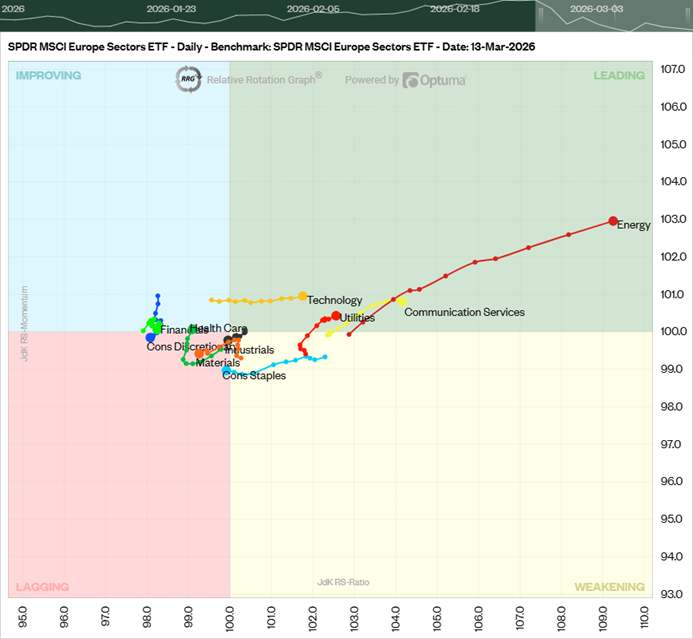
Source: RRG Research, as at 13 March 2026. For illustrative purposes only
This chart shows MSCI Europe sectors on the move on a day-to-day basis, with the “tails” indicating the direction of travel over the previous two weeks. In this screenshot. Energy stands out for gaining strength in the LEADING quadrant.
Example: Rotation of Industrials and Financials in Europe Financials (on weekly view)
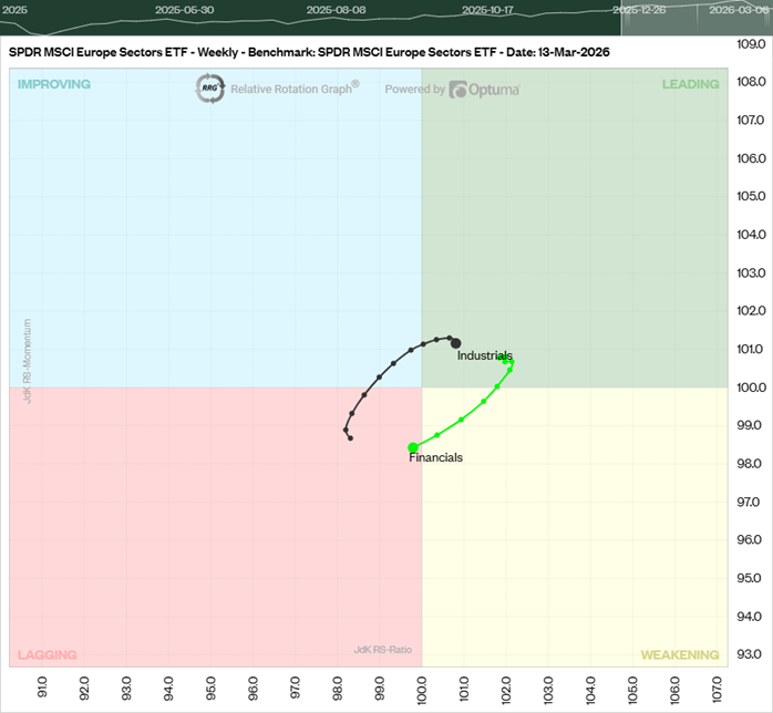
Source: RRG Research, as at 13 March 2026 For illustrative purposes only
The second chart shows the rotation of Europe Financials from LEADING to LAGGING, with the current state looking less attractive given that the sector’s relative strength and momentum has gone negative. Europe Industrials is showing the oppositive case over the same period of ten weeks.